ETJava Beta | Java
 注册
登录
注册
登录
注册
登录
注册
登录
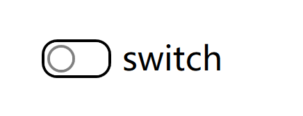
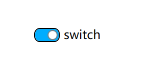
先看一下效果吧:
isChecked = false 的时候的效果
isChecked = true 的时候的效果
然后我们来实现一下这个效果吧
第一步:创建一个空的wpf项目;
第二步:在项目里面添加一个checkbox
    <Grid>
        <CheckBox HorizontalAlignment="Center" IsChecked="True"
                  BorderBrush="Black" VerticalAlignment="Center"
                  Content="switch" Background="#FF00ADFF"/>
    </Grid>
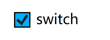
这个时候的checkbox的样子是这样的
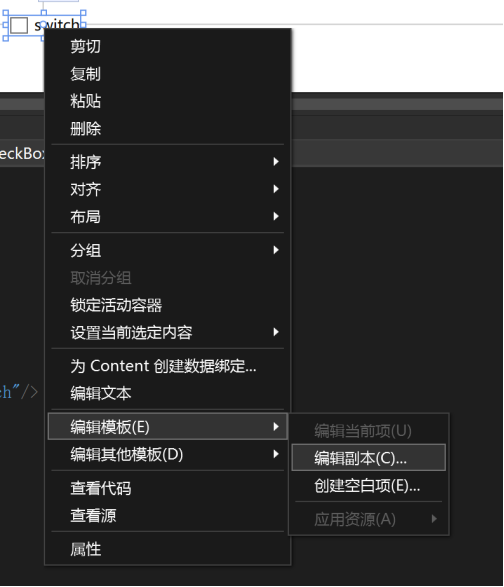
第三步:在页面中右键checkbox,选择 编辑模板 ,再 编辑副本, 之后确定
vs就会给我们自动生成一个名为 ”CheckBoxStyle1” 的Checkbox的默认样式的代码,我们通过修改默认样式的代码,把普通的Checkbox变成一个开关。
第四步:修改默认样式
                        <Grid x:Name="templateRoot" Background="Transparent" SnapsToDevicePixels="True">
                            <Grid.ColumnDefinitions>
                                <ColumnDefinition Width="Auto"/>
                                <ColumnDefinition Width="*"/>
                            </Grid.ColumnDefinitions>
                            <Border x:Name="PART_Border" BorderBrush="{TemplateBinding BorderBrush}" Background="{TemplateBinding Background}"
                                    BorderThickness="1" Height="14" Width="25" CornerRadius="5">
                                <Border x:Name="SwitchBorder" BorderThickness="1" BorderBrush="Gray" Background="White" Width="10"
                                        Margin="1" CornerRadius="5" HorizontalAlignment="Right"/>
                            </Border>
                            <ContentPresenter x:Name="contentPresenter" Grid.Column="1" Focusable="False" HorizontalAlignment="{TemplateBinding HorizontalContentAlignment}"
                                              Margin="{TemplateBinding Padding}" RecognizesAccessKey="True" SnapsToDevicePixels="{TemplateBinding SnapsToDevicePixels}"
                                              VerticalAlignment="{TemplateBinding VerticalContentAlignment}"/>
                        </Grid>
把之前的样式代码改成上面的代码,trigger部分,把报错的部分全部删除
这个时候,我们的开关样式就已经完成了

我们现在需要添加一些trigger和动画来实现切换效果
第五步:添加动画和trigger
<Storyboard x:Key="SwitchChecked">
    <DoubleAnimationUsingKeyFrames Storyboard.TargetName="SwitchBorder" Storyboard.TargetProperty="(FrameworkElement.Width)">
        <EasingDoubleKeyFrame KeyTime="00:00:00" Value="10"/>
        <EasingDoubleKeyFrame KeyTime="00:00:00.2500000" Value="20"/>
        <EasingDoubleKeyFrame KeyTime="00:00:00.5000000" Value="10"/>
    </DoubleAnimationUsingKeyFrames>
    <ObjectAnimationUsingKeyFrames Storyboard.TargetName="SwitchBorder" Storyboard.TargetProperty="(FrameworkElement.HorizontalAlignment)">
        <DiscreteObjectKeyFrame KeyTime="00:00:00" Value="{x:Static HorizontalAlignment.Left}"/>
        <DiscreteObjectKeyFrame KeyTime="00:00:00.2500000" Value="{x:Static HorizontalAlignment.Right}"/>
        <DiscreteObjectKeyFrame KeyTime="00:00:00.5000000" Value="{x:Static HorizontalAlignment.Right}"/>
    </ObjectAnimationUsingKeyFrames>
</Storyboard>

<Storyboard x:Key="SwitchUnchecked">
    <DoubleAnimationUsingKeyFrames Storyboard.TargetName="SwitchBorder" Storyboard.TargetProperty="(FrameworkElement.Width)">
        <EasingDoubleKeyFrame KeyTime="00:00:00" Value="10"/>
        <EasingDoubleKeyFrame KeyTime="00:00:00.2500000" Value="20"/>
        <EasingDoubleKeyFrame KeyTime="00:00:00.5000000" Value="10"/>
    </DoubleAnimationUsingKeyFrames>
    <ObjectAnimationUsingKeyFrames Storyboard.TargetName="SwitchBorder" Storyboard.TargetProperty="(FrameworkElement.HorizontalAlignment)">
        <DiscreteObjectKeyFrame KeyTime="00:00:00" Value="{x:Static HorizontalAlignment.Right}"/>
        <DiscreteObjectKeyFrame KeyTime="00:00:00.2500000" Value="{x:Static HorizontalAlignment.Left}"/>
        <DiscreteObjectKeyFrame KeyTime="00:00:00.5000000" Value="{x:Static HorizontalAlignment.Left}"/>
    </ObjectAnimationUsingKeyFrames>
</Storyboard>
上面这段代码就是表示不同状态下的不同动画效果,通过改变SwitchBoder的宽度和对齐方式,就可以实现了
然后我们再把这段动画效果运用到模板中,再添加3个trigger,就可以了
                        <ControlTemplate.Triggers>
                            <Trigger Property="HasContent" Value="true">
                                <Setter Property="FocusVisualStyle" Value="{StaticResource OptionMarkFocusVisual}"/>
                                <Setter Property="Padding" Value="4,-1,0,0"/>
                            </Trigger>
                            <EventTrigger RoutedEvent="{x:Static CheckBox.CheckedEvent}">
                                <BeginStoryboard Storyboard="{StaticResource SwitchChecked}"/>
                            </EventTrigger>
                            <EventTrigger RoutedEvent="{x:Static CheckBox.UncheckedEvent}">
                                <BeginStoryboard Storyboard="{StaticResource SwitchUnchecked}"/>
                            </EventTrigger>
                            <Trigger Property="IsEnabled" Value="false">
                                <Setter Property="Background" TargetName="PART_Border" Value="{StaticResource OptionMark.Disabled.Background}"/>
                                <Setter Property="BorderBrush" TargetName="PART_Border" Value="{StaticResource OptionMark.Disabled.Border}"/>
                            </Trigger>
                            <Trigger Property="IsChecked" Value="False">
                                <Setter Property="Background" Value="White" TargetName="PART_Border"/>
                                <Setter Property="HorizontalAlignment" Value="Left" TargetName="SwitchBorder"/>
                            </Trigger>
                            <Trigger Property="IsMouseOver" Value="True">
                                <Setter Property="BorderBrush" TargetName="PART_Border" Value="{StaticResource OptionMark.MouseOver.Border}"/>
                            </Trigger>

                        </ControlTemplate.Triggers>
到现在,样式和动画就已经完成了,我们再把代码全部剪切到App.xaml这个项目资源文件下面,再删掉style的命名,x:Key="CheckBoxStyle1"删掉,
这样子我们的项目里面的checkbox就都是开关的样式了,运行项目也不会报错啦,最后的代码如下
    <Application.Resources>

        <Storyboard x:Key="SwitchChecked">
            <DoubleAnimationUsingKeyFrames Storyboard.TargetName="SwitchBorder" Storyboard.TargetProperty="(FrameworkElement.Width)">
                <EasingDoubleKeyFrame KeyTime="00:00:00" Value="10"/>
                <EasingDoubleKeyFrame KeyTime="00:00:00.2500000" Value="20"/>
                <EasingDoubleKeyFrame KeyTime="00:00:00.5000000" Value="10"/>
            </DoubleAnimationUsingKeyFrames>
            <ObjectAnimationUsingKeyFrames Storyboard.TargetName="SwitchBorder" Storyboard.TargetProperty="(FrameworkElement.HorizontalAlignment)">
                <DiscreteObjectKeyFrame KeyTime="00:00:00" Value="{x:Static HorizontalAlignment.Left}"/>
                <DiscreteObjectKeyFrame KeyTime="00:00:00.2500000" Value="{x:Static HorizontalAlignment.Right}"/>
                <DiscreteObjectKeyFrame KeyTime="00:00:00.5000000" Value="{x:Static HorizontalAlignment.Right}"/>
            </ObjectAnimationUsingKeyFrames>
        </Storyboard>

        <Storyboard x:Key="SwitchUnchecked">
            <DoubleAnimationUsingKeyFrames Storyboard.TargetName="SwitchBorder" Storyboard.TargetProperty="(FrameworkElement.Width)">
                <EasingDoubleKeyFrame KeyTime="00:00:00" Value="10"/>
                <EasingDoubleKeyFrame KeyTime="00:00:00.2500000" Value="20"/>
                <EasingDoubleKeyFrame KeyTime="00:00:00.5000000" Value="10"/>
            </DoubleAnimationUsingKeyFrames>
            <ObjectAnimationUsingKeyFrames Storyboard.TargetName="SwitchBorder" Storyboard.TargetProperty="(FrameworkElement.HorizontalAlignment)">
                <DiscreteObjectKeyFrame KeyTime="00:00:00" Value="{x:Static HorizontalAlignment.Right}"/>
                <DiscreteObjectKeyFrame KeyTime="00:00:00.2500000" Value="{x:Static HorizontalAlignment.Left}"/>
                <DiscreteObjectKeyFrame KeyTime="00:00:00.5000000" Value="{x:Static HorizontalAlignment.Left}"/>
            </ObjectAnimationUsingKeyFrames>
        </Storyboard>


        <Style x:Key="FocusVisual">
            <Setter Property="Control.Template">
                <Setter.Value>
                    <ControlTemplate>
                        <Rectangle Margin="2" StrokeDashArray="1 2" Stroke="{DynamicResource {x:Static SystemColors.ControlTextBrushKey}}" SnapsToDevicePixels="true" StrokeThickness="1"/>
                    </ControlTemplate>
                </Setter.Value>
            </Setter>
        </Style>
        <Style x:Key="OptionMarkFocusVisual">
            <Setter Property="Control.Template">
                <Setter.Value>
                    <ControlTemplate>
                        <Rectangle Margin="14,0,0,0" StrokeDashArray="1 2" Stroke="{DynamicResource {x:Static SystemColors.ControlTextBrushKey}}" SnapsToDevicePixels="true" StrokeThickness="1"/>
                    </ControlTemplate>
                </Setter.Value>
            </Setter>
        </Style>
        <SolidColorBrush x:Key="OptionMark.Static.Background" Color="#FFFFFFFF"/>
        <SolidColorBrush x:Key="OptionMark.Static.Border" Color="#FF707070"/>
        <SolidColorBrush x:Key="OptionMark.Static.Glyph" Color="#FF212121"/>
        <SolidColorBrush x:Key="OptionMark.MouseOver.Background" Color="#FFF3F9FF"/>
        <SolidColorBrush x:Key="OptionMark.MouseOver.Border" Color="#FF5593FF"/>
        <SolidColorBrush x:Key="OptionMark.MouseOver.Glyph" Color="#FF212121"/>
        <SolidColorBrush x:Key="OptionMark.Pressed.Background" Color="#FFD9ECFF"/>
        <SolidColorBrush x:Key="OptionMark.Pressed.Border" Color="#FF3C77DD"/>
        <SolidColorBrush x:Key="OptionMark.Pressed.Glyph" Color="#FF212121"/>
        <SolidColorBrush x:Key="OptionMark.Disabled.Background" Color="#FFE6E6E6"/>
        <SolidColorBrush x:Key="OptionMark.Disabled.Border" Color="#FFBCBCBC"/>
        <SolidColorBrush x:Key="OptionMark.Disabled.Glyph" Color="#FF707070"/>
        <Style TargetType="{x:Type CheckBox}">
            <Setter Property="FocusVisualStyle" Value="{StaticResource FocusVisual}"/>
            <Setter Property="Background" Value="{StaticResource OptionMark.Static.Background}"/>
            <Setter Property="BorderBrush" Value="{StaticResource OptionMark.Static.Border}"/>
            <Setter Property="Foreground" Value="{DynamicResource {x:Static SystemColors.ControlTextBrushKey}}"/>
            <Setter Property="BorderThickness" Value="1"/>
            <Setter Property="Template">
                <Setter.Value>
                    <ControlTemplate TargetType="{x:Type CheckBox}">
                        <Grid x:Name="templateRoot" Background="Transparent" SnapsToDevicePixels="True">
                            <Grid.ColumnDefinitions>
                                <ColumnDefinition Width="Auto"/>
                                <ColumnDefinition Width="*"/>
                            </Grid.ColumnDefinitions>
                            <Border x:Name="PART_Border" BorderBrush="{TemplateBinding BorderBrush}" Background="{TemplateBinding Background}"
                                    BorderThickness="1" Height="14" Width="25" CornerRadius="5">
                                <Border x:Name="SwitchBorder" BorderThickness="1" BorderBrush="Gray" Background="White" Width="10"
                                        Margin="1" CornerRadius="5" HorizontalAlignment="Right"/>
                            </Border>
                            <ContentPresenter x:Name="contentPresenter" Grid.Column="1" Focusable="False" HorizontalAlignment="{TemplateBinding HorizontalContentAlignment}"
                                              Margin="{TemplateBinding Padding}" RecognizesAccessKey="True" SnapsToDevicePixels="{TemplateBinding SnapsToDevicePixels}"
                                              VerticalAlignment="{TemplateBinding VerticalContentAlignment}"/>
                        </Grid>
                        <ControlTemplate.Triggers>
                            <Trigger Property="HasContent" Value="true">
                                <Setter Property="FocusVisualStyle" Value="{StaticResource OptionMarkFocusVisual}"/>
                                <Setter Property="Padding" Value="4,-1,0,0"/>
                            </Trigger>
                            <EventTrigger RoutedEvent="{x:Static CheckBox.CheckedEvent}">
                                <BeginStoryboard Storyboard="{StaticResource SwitchChecked}"/>
                            </EventTrigger>
                            <EventTrigger RoutedEvent="{x:Static CheckBox.UncheckedEvent}">
                                <BeginStoryboard Storyboard="{StaticResource SwitchUnchecked}"/>
                            </EventTrigger>
                            <Trigger Property="IsEnabled" Value="false">
                                <Setter Property="Background" TargetName="PART_Border" Value="{StaticResource OptionMark.Disabled.Background}"/>
                                <Setter Property="BorderBrush" TargetName="PART_Border" Value="{StaticResource OptionMark.Disabled.Border}"/>
                            </Trigger>
                            <Trigger Property="IsChecked" Value="False">
                                <Setter Property="Background" Value="White" TargetName="PART_Border"/>
                                <Setter Property="HorizontalAlignment" Value="Left" TargetName="SwitchBorder"/>
                            </Trigger>
                            <Trigger Property="IsMouseOver" Value="True">
                                <Setter Property="BorderBrush" TargetName="PART_Border" Value="{StaticResource OptionMark.MouseOver.Border}"/>
                            </Trigger>

                        </ControlTemplate.Triggers>
                    </ControlTemplate>
                </Setter.Value>
            </Setter>
        </Style>

    </Application.Resources>
下面是广告:
项目github地址:bearhanQ/WPFFramework: Share some experience (github.com)
QQ技术交流群:332035933;
 官方公众号
官方公众号